TASK

Research the SLG’s existing brand identity as a whole and redesign a comprehensive visual identity and brand.

CLIENT

The South London Gallery

AUDIENCE

the SLG’s existing clientele (local young creatives) but on a larger scale, the wider London, who seeks exploration/discovery and finding “hidden gems”.

CHALLENGE

The SLG’s existing branding is strong but incohesive (online vs in gallery).

Geographically, the SLG is in an area that seems inaccessible to the wider London.

Tone of voice: Visionary, Intentional, Confident.

INSPIRATION

I was inspired by the SLG’s existing visual brand identity online and their verbal identity as well as other competitor brands. My main goal was to bring out what stood out to me in their existing verbal identity – that they are confident, they are visionaries and that they are intentional – and bring that out through a new visual identity that would stand the test of time.
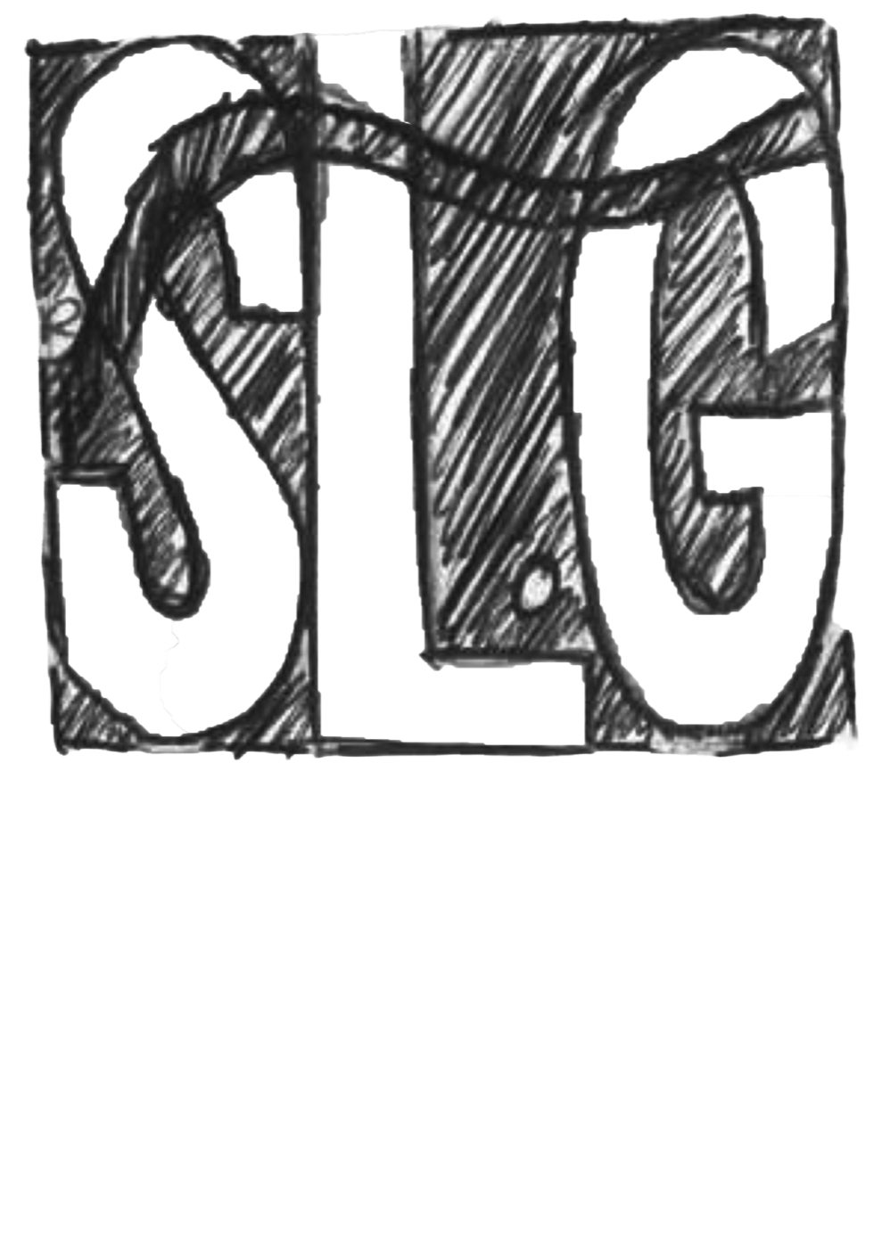
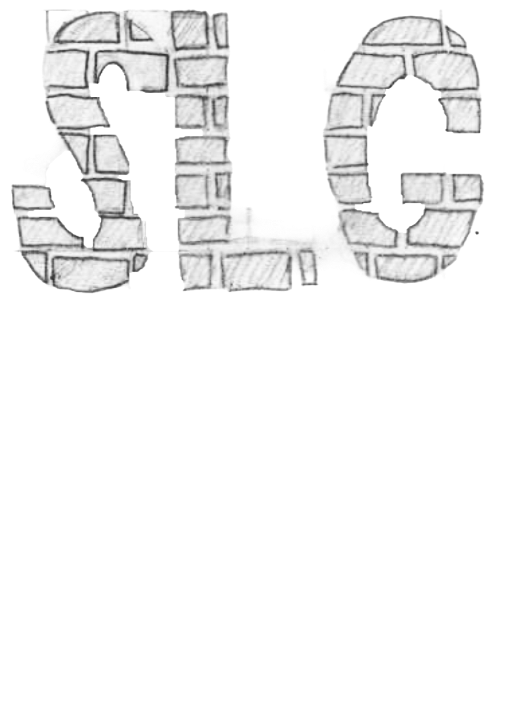
INITIAL IDEAS/SKETCHES

Sketch of the word South in rounded block letters
Sketch of SLG lettering built from bricks
Sketch of SLG letters built from simple shapes

LOGOS

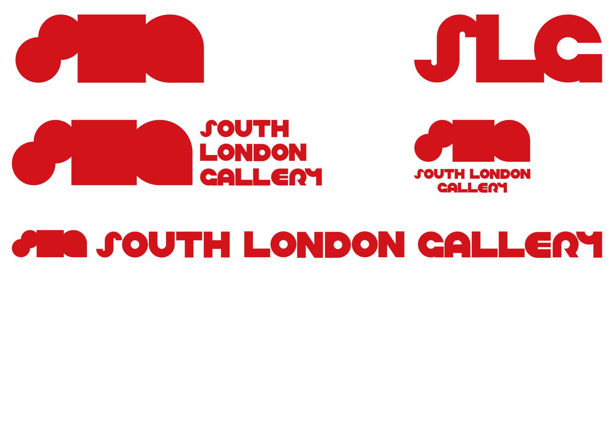
The new South London Gallery logos in red
Brand Logo/Symbol Brand Lettermark Primary Combination Mark Secondary Combination Mark Secondary Combination Mark

TYPOGRAPHY

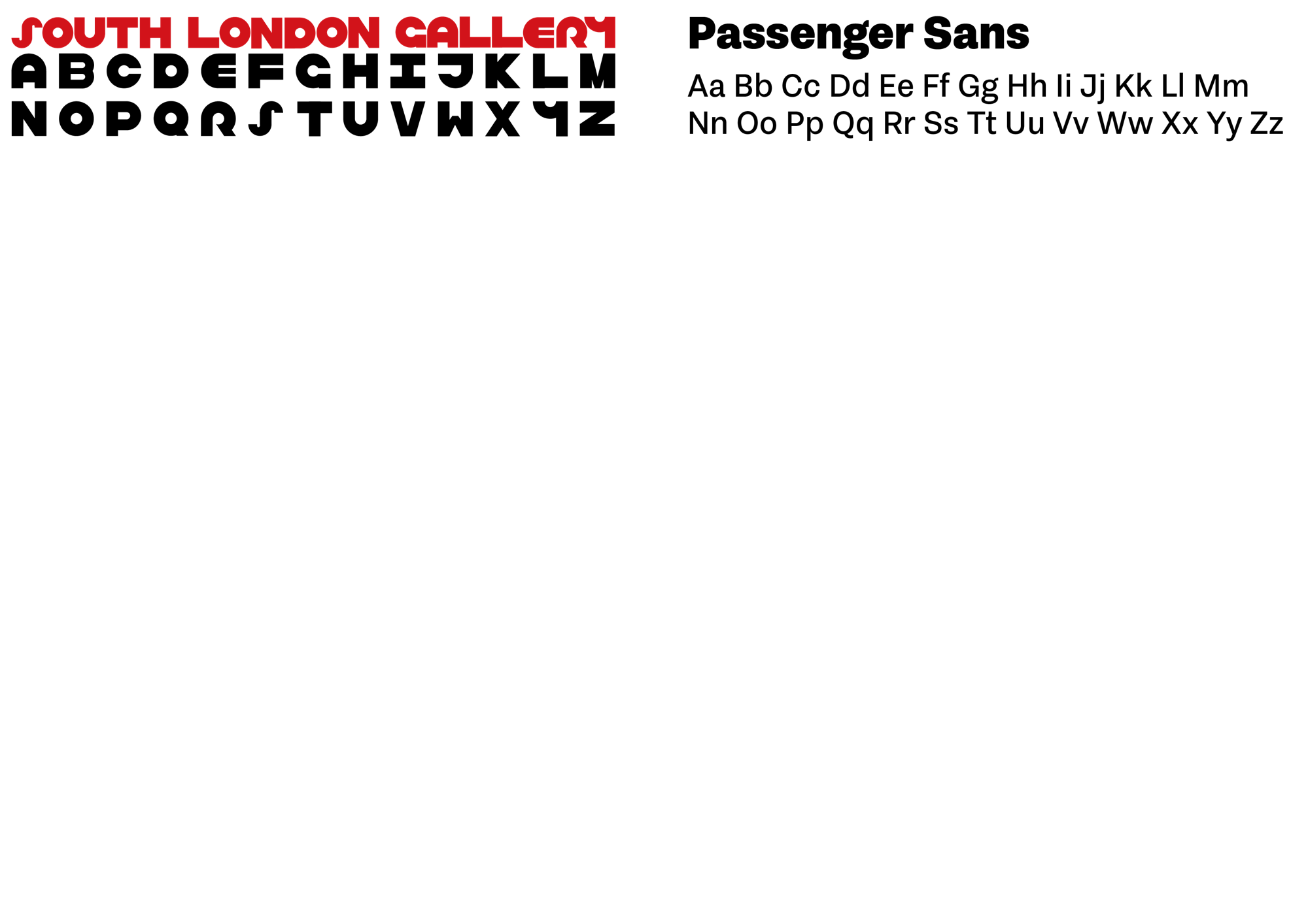
The South London Gallery wordmark, full alphabet and the Passenger Sans typeface

WAYFINDING

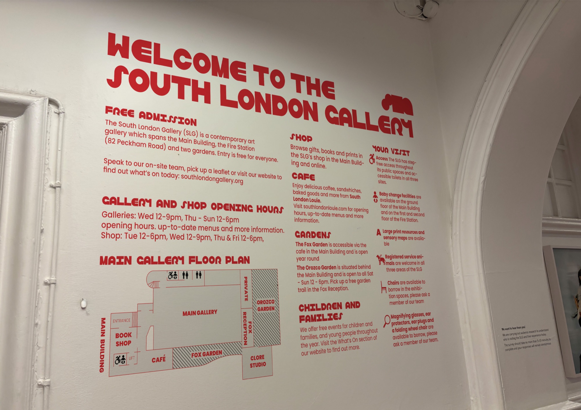
Red Welcome to the South London Gallery wall graphic with floor plan
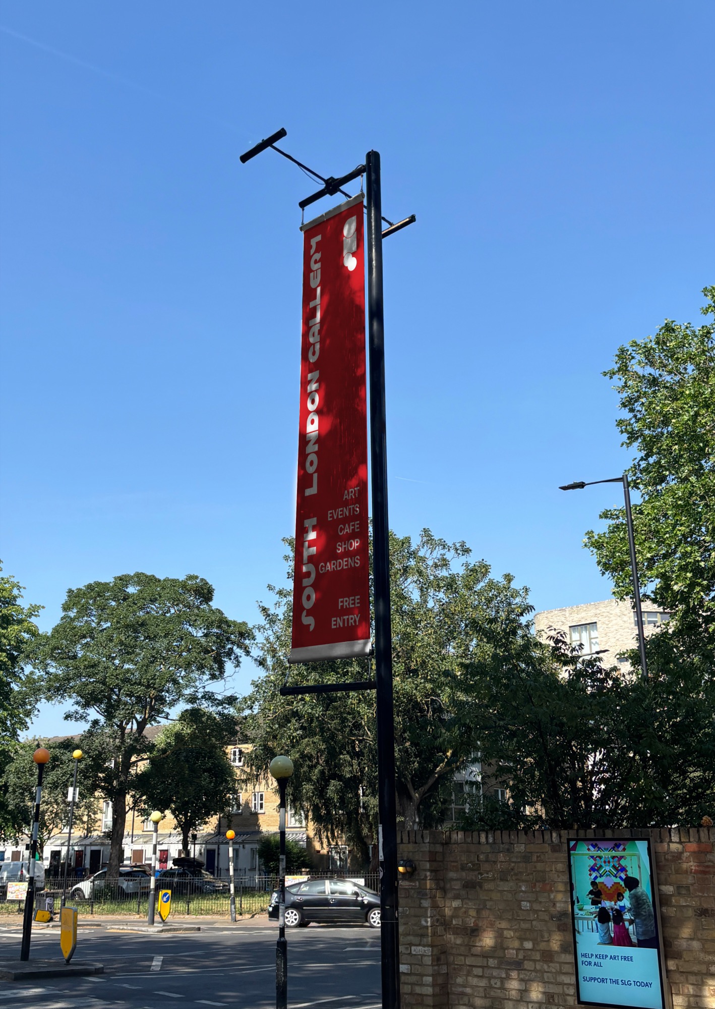
Red South London Gallery banner on a lamppost
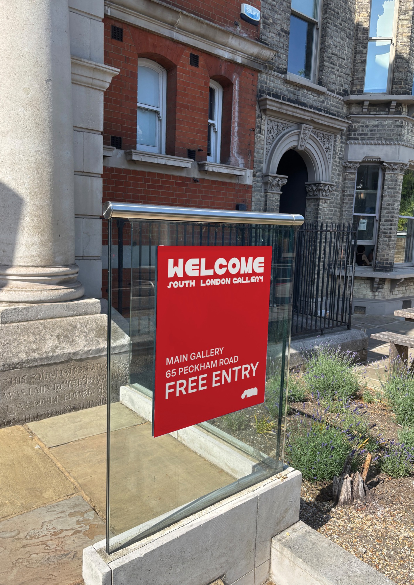
South London Gallery welcome sign
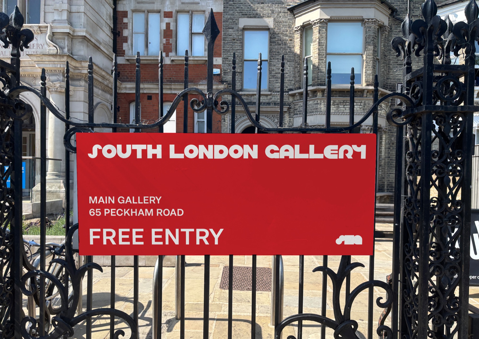
South London Gallery sign on the gallery gates

POSTERS

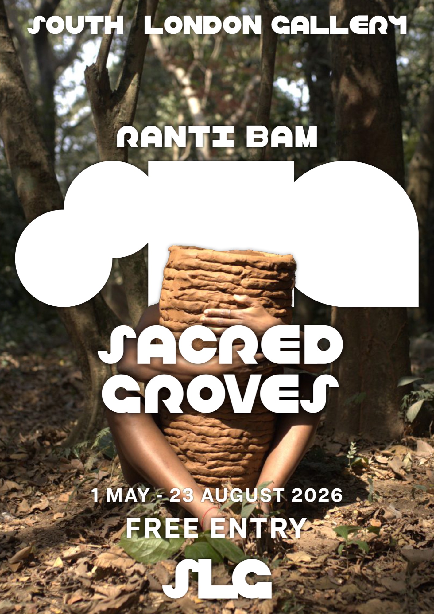
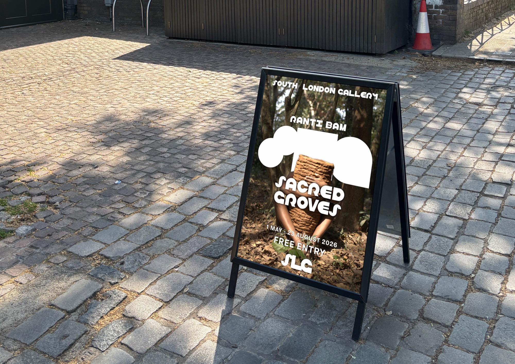
Sacred Groves exhibition poster
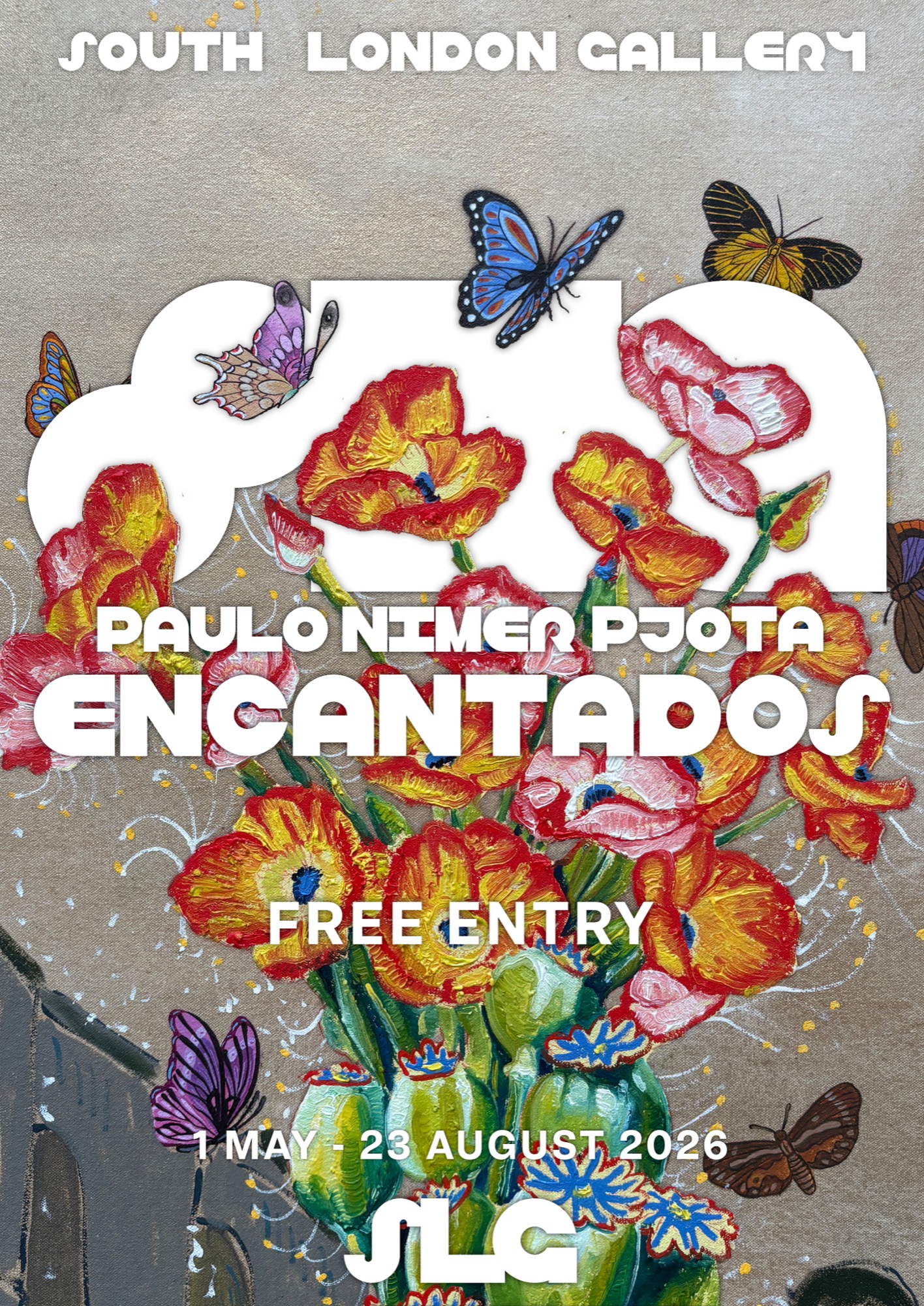
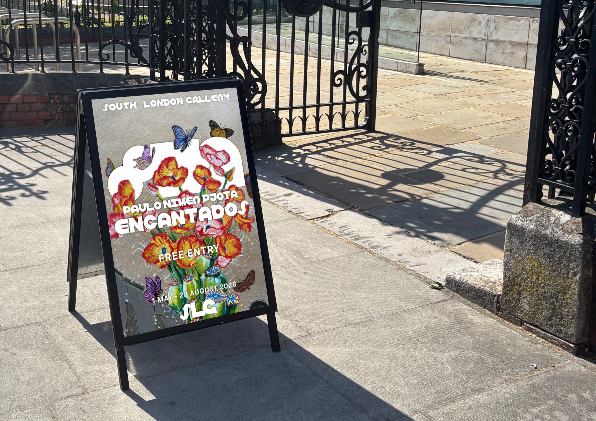
Encantados exhibition poster
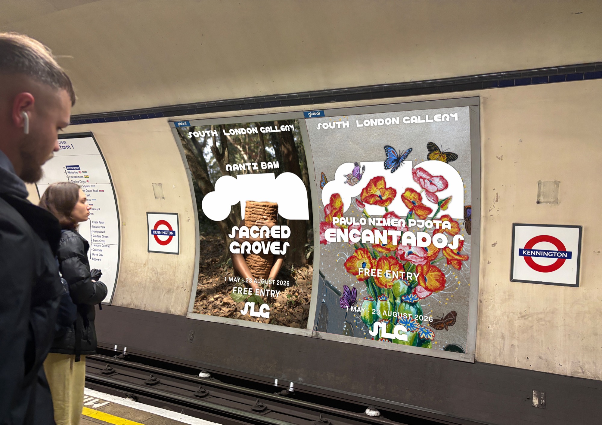
South London Gallery poster in use
South London Gallery poster on an A-frame sign
South London Gallery posters on a London Underground platform

MERCHANDISE

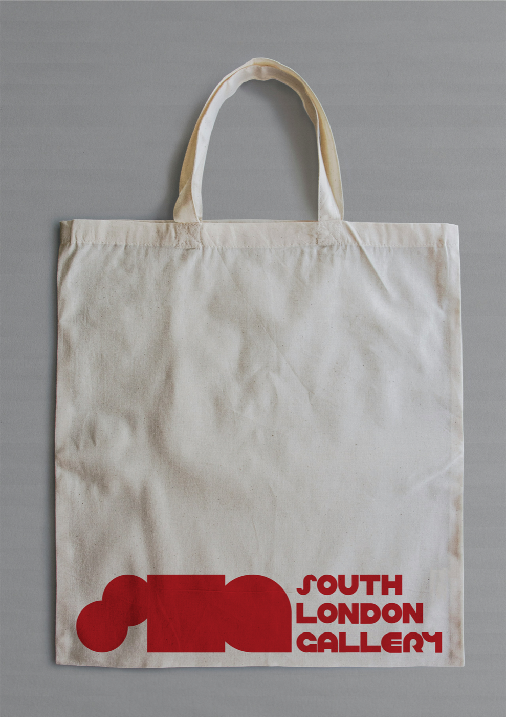
White South London Gallery tote bag with the red logo
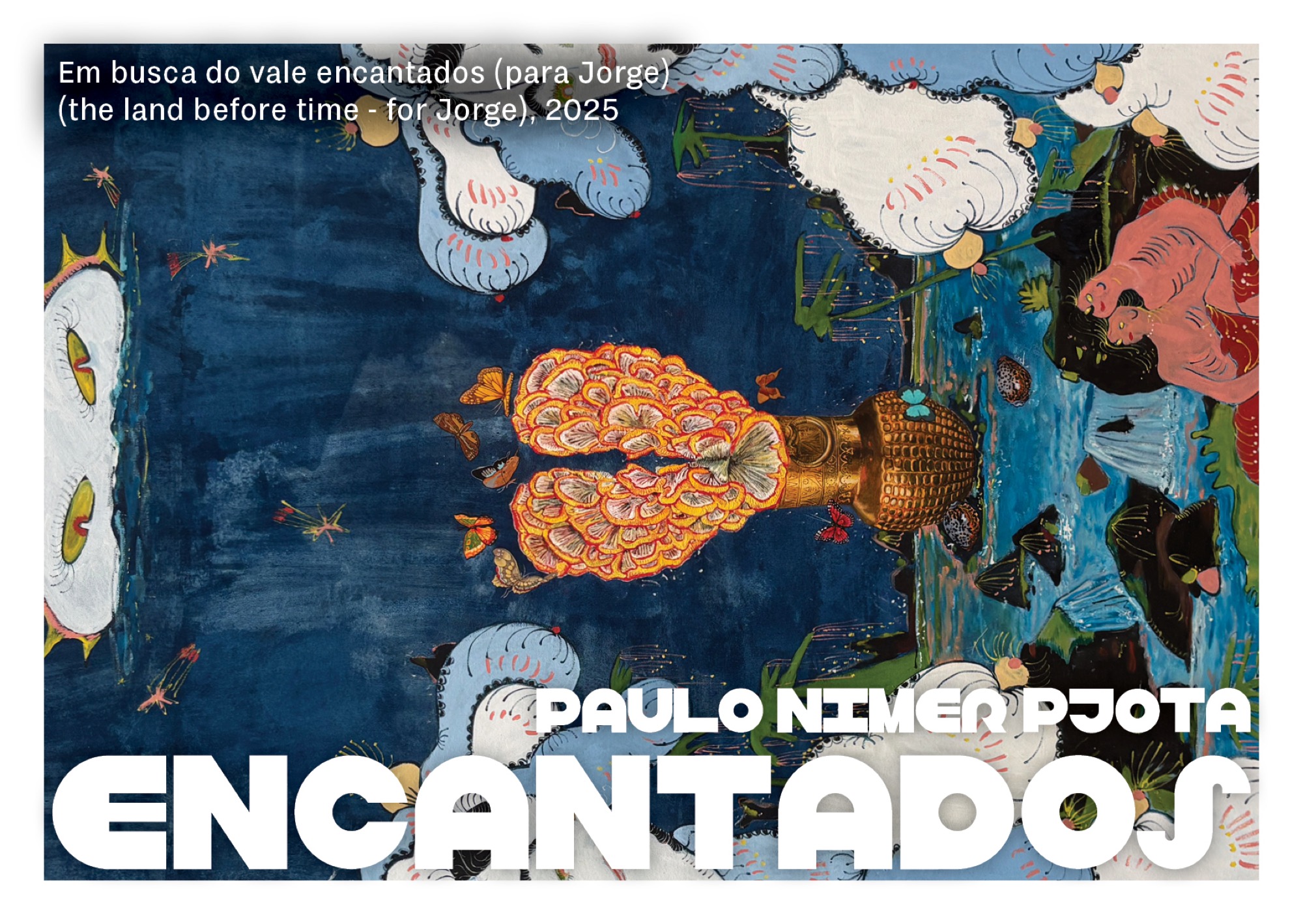
Encantados exhibition postcard
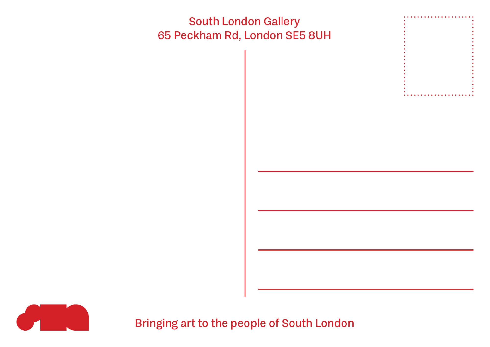
Back of a South London Gallery postcard
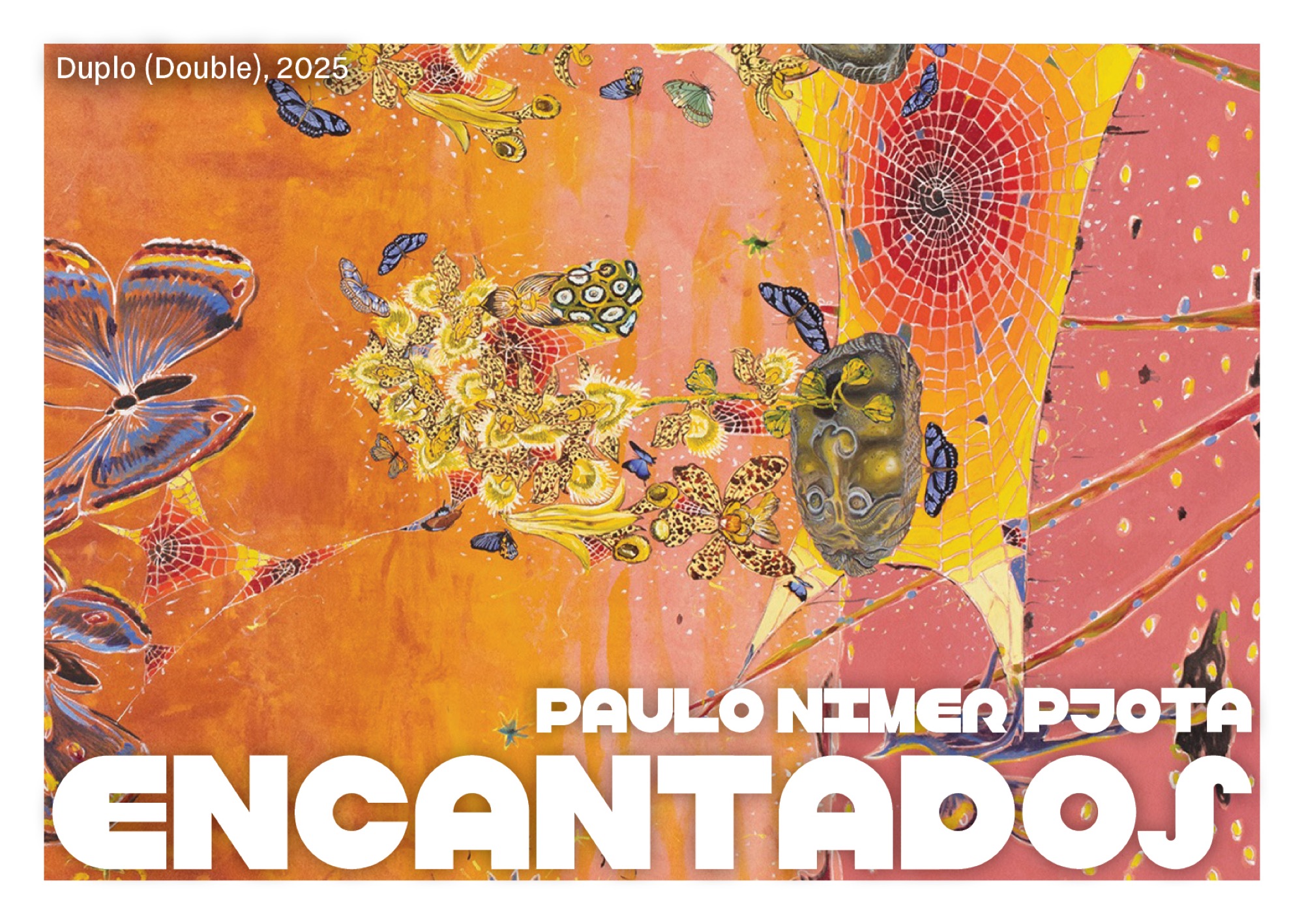
Encantados exhibition postcard

ANIMATED LOGO